Pages
▼
Friday, July 31, 2015
Saturday, July 18, 2015
GISTEMP only 0.04°C Behind Models
With GISTEMP's new datasets, I thought I'd update (from here) its comparison with CMIP5 models. (Again, GISS's updates are explained here.)
I'm comparing the total warming for each dataset, calculated as linear_slope*time_interval, as time goes by:
I choose the scenario RCP8.5 for comparison, but it doesn't matter much as all the RCPs use the same historical data up to 2005 and get essentially the same results 'til now. (They aren't exactly the same, I guess because the models are spun up to slightly different equilibrium states before beginning their calculation in 1880).
The model is 0.04°C (5%) ahead of observations.
I'm comparing the total warming for each dataset, calculated as linear_slope*time_interval, as time goes by:
The model is 0.04°C (5%) ahead of observations.
A Current Comparison of Models and Observations
As you probably heard by now, GISTEMP measured June as the warmest June on record. Also, they have updated their methodology -- you can read more here. Basically, they updated their land and sea surface numbers to the new versions put out by NOAA in the recent Karl et al paper in Science. (Reminder to people who don't like new data -- the Karl et al changes are smaller than the recent UAH changes to their lower troposphere numbers.)
With that, here's the model-observation comparison Gavin Schmitt of NASA GISS tweeted the other day (though I'm not sure why he wouldn't use CMIP5):
Which comes with the usual caveat:
With that, here's the model-observation comparison Gavin Schmitt of NASA GISS tweeted the other day (though I'm not sure why he wouldn't use CMIP5):
So here are model predictions of temperatures from the early 2000s (grey shading is mainly weather uncertainty): pic.twitter.com/vgnMM5iT0I
— Gavin Schmidt (@ClimateOfGavin) July 16, 2015
(Note that these climate models are not initialized to observations, and cannot predict phase of El Niño etc. ahead of time).
— Gavin Schmidt (@ClimateOfGavin) July 16, 2015
Thursday, July 16, 2015
Interesting Graphs from NOAA's Press Conference
A few graphs I found interesting from today's press briefing by NOAA on the State of the Climate 2014 -- because you can never have too many summary graphs that extend over several decades.
Reanalysis shows more warming in the lower troposphere in the last 15-20 years than does UAH or RSS (this graph is from UAH's v5.6 dataset, not the latest v6.0beta2, perhaps because the latter hasn't been published yet (as far as I know):
Rise in global mean sea level, with contributions from the increase in ocean mass (mostly from land-based glaciers melting) and from "steric" changes due to the thermal expansion of ocean water. It's about 2-1 for the mass increase, and their sum is the total change in sea level:
Changes in North Amerian snow cover:
NOAA's prognosis for coming years was (of course): more of the same.
Reanalysis shows more warming in the lower troposphere in the last 15-20 years than does UAH or RSS (this graph is from UAH's v5.6 dataset, not the latest v6.0beta2, perhaps because the latter hasn't been published yet (as far as I know):
Changes in extreme days:
Changes in North Amerian snow cover:
Temperature changes at depth (60 feet) for several permafrost sites in Alaska:
Wednesday, July 08, 2015
Fwd: Breaking News: South Carolina House Backs Removal of Confederate Flag
Yippee. Shame it took a mass murder to accomplish this, but it seems people do still have hearts beating under their shirts & blouses.
That's what passes for hope these days.
-------- Forwarded Message --------
Breaking News Alert - The New York Times

That's what passes for hope these days.
-------- Forwarded Message --------
| Subject: | Breaking News: South Carolina House Backs Removal of Confederate Flag |
|---|---|
| Date: | Thu, 09 Jul 2015 01:12:13 -0400 |
| From: | NYTimes.com News Alert <nytdirect@nytimes.com> |
| To: | david.appell@gmail.com |
| |||||||||||||||||||||||
The Internet: "A Sinkhole for the Gullible"
I thought this was especially tenchant, from Frank Bruni's recent column on anti-vaxxers, but pertaining to other debates too:
Sunday, July 05, 2015
And the Rest of You Are On Your Own
@thingsbreak Heat waves are most usefully defined relative to what people have adapted to; were adapted to different T's in early 20th cent
— Judith Curry (@curryja) July 3, 2015
Friday, July 03, 2015
Why Very Warm Events are Exponentially More Probable in a Warmer World
As you've heard, it's been extremely hot in the US Northwest -- it's 98°F as I start writing this at 6 pm -- and very unpleasant. It feels like Arizona -- walking outside is like walking into a furnace. (Our normal high for the day is 79°F.) I never run my air conditioner until it's time to go to bed, so the cats can go in and out of the back door as they want, but today at 4 pm I just couldn't stand it anymore and turned it on.
In June, there was only one day here in Salem that was below normal -- June 1st, at -0.5°F below average. For the month we were 7.5°F above average, with only 0.67 inches of rain, just 45% of average. Ugly.
Is this high, prolonged heat wave due to manmade global warming? Would this heat wave have happened in a world without AGW? I don't know. Cliff Mass says it's just natural variability, but others have disagreed with him in the past.
But here's something: a warmer world increases the chances of extreme temperatures exponentially.
Here's what I mean, with some gory details, but not too bad. And I get to practice my LaTeX, which I wrote my thesis in but haven't used since.
 Suppose the background temperature of the world is T1, and we want to calculate the probability of an event with temperature T -- that is, the change of occurence of temperature T.
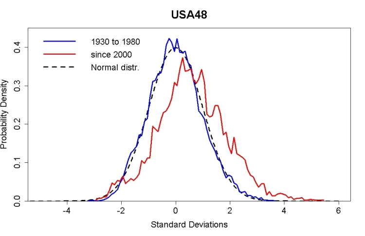
A few years ago Tamino calculated the probability spread using data for the continental US (USA48), and got the figure to the right. It's very close to a normal (Gaussian) distribution, and that's what I'll assume for the spread of probabilities. We're calculating the vertical distance between the blue and red curves, for any value of temperature along the x-axis.
As Wikipedia says,
In June, there was only one day here in Salem that was below normal -- June 1st, at -0.5°F below average. For the month we were 7.5°F above average, with only 0.67 inches of rain, just 45% of average. Ugly.
Is this high, prolonged heat wave due to manmade global warming? Would this heat wave have happened in a world without AGW? I don't know. Cliff Mass says it's just natural variability, but others have disagreed with him in the past.
But here's something: a warmer world increases the chances of extreme temperatures exponentially.
Here's what I mean, with some gory details, but not too bad. And I get to practice my LaTeX, which I wrote my thesis in but haven't used since.
 Suppose the background temperature of the world is T1, and we want to calculate the probability of an event with temperature T -- that is, the change of occurence of temperature T.
A few years ago Tamino calculated the probability spread using data for the continental US (USA48), and got the figure to the right. It's very close to a normal (Gaussian) distribution, and that's what I'll assume for the spread of probabilities. We're calculating the vertical distance between the blue and red curves, for any value of temperature along the x-axis.
As Wikipedia says,
So, if the background temperature is T1, the probability of the occurrence of a temperature T is
Now suppose the world gets warmer, and the background temperature changes from T1 to T2, both less than T. Let ΔT = T2 - T1 be the amount of warming.
There is a similar equation to the above for p(T,T2), the probability of an event with temperature T in the warmer world T2, just by replacing T1 above with T2. I'll assume the spread of the distributions, σ, is the same in both worlds.
We want to calculate the change in the probability, Δp, of the event with temperature T:
as a function of ΔT.
After some algebra, we find
where it's understood, just to make things look simplier, T, T1 and T2 are all divided by σ√2.
We can gnaw on this further to get
where I've used the fact that
(except maybe on Venus!). All the crap on the left-hand side is junk, not dependent on ΔT or T2. So we get
where f is some function we don't really care about here.
So -- for a temperature change ΔT, the probability of the occurrence of temperature T goes up exponentially with ΔT.
This, it seems to me, is proof of why extreme temperatures get much more likely in a warming world, faster than the linear amount by which the world warms.


