On a closer inspection, my skepticism is growing.
 As I said, the paper looked at where people moved, and found that, on avarage, they perferred warmer temperatures and less humid summers. Their study gives, for each year, a data point that represents the populated-weighted preferred value for temperature, humidity, precipitation, and days of precipition -- these are the figures to the right. (Click to enlarge.)
The thick black lines are calculated by LOWESS regression.
But much of this data is quite scattered --only graph b, for mean daily maximum tempertures in July, is tight enough for a fitted curve to be obvious.
 I'm not an expert in Loess regression, but my reaction here is to be very skeptical about trying to extract meaningful curves from such widely scattered data -- curves meaningful enough that useful information can be found in their trends.
Consider graph c, plotting mean daily relative humidity for July. Why did people (population-weighted people) perfer higher humidities from 1974 to about 1995, and then preferred lower humidities from 1995 to 2013?
Or graph a: why did people cease to care about the mean daily maximum temperature in January after about 1993? Or at least care enough to move on account of it?
It seems to me that too much else is going on with people's decisions to move than simply a preference for a climate. I've lived in 10 different states, and most of the time I moved it wasn't for climate, it was for opportunity. (Except that I did choose to go to graduate school back east, partly for the climate, and I moved from Arizona and to New England in fair part because of climate. But I moved to Arizona for an opportunity, and I left New England and came to Oregon for an opportunity, not for climate or weather. Frankly I miss New England's weather (except in April and May.))
So where did people -- again, population-weighted people -- move from, and where did they move to? From the paper:

The value plotted is their mean WPI -- weather preference index -- by county. They write that WPI is "an indicator of the average American’s revealed preference for different types of weather conditions. The WPI’s unit of measure is the ceteris paribus expected rate of population change associated with that year’s weather."
They add, "In using these studies for our purposes, we assume that, all things being equal, Americans move to, and continue to reside in, places with local climates that they prefer."
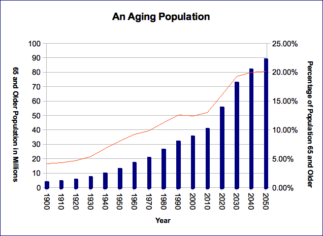
The results on the map aren't especially surprising. But, again, to assume people move purely for weather is simplistic. The population of the U.S. has, on average, been aging over recent decades. Older people might tend to favor warmer temperatures on average, but until recent decades many didn't have the money to move to a more favorable climate after retiring. The rust belt in the US -- Pennsylvania, Ohio, Michigan, etc -- has lost jobs due to global economic forces, and people had to move to where they could find new jobs. Living in the northeastern US is relatively expensive, so naturally people look away from that region when they considered moving. Colorado might have better weather, in the eyes of many, than Massachusetts, but it defintely had lower home prices. And then there's culture. Utah might have great weather, but its culture is one that not everyone would prefer moving to.
And so on.
No comments:
Post a Comment