Saturday, May 23, 2020

What's Dangerous, What Isn't

I have noticed that the Washington Post thinks any warming anywhere above 2°C, even just a bit above, is "dangerous":
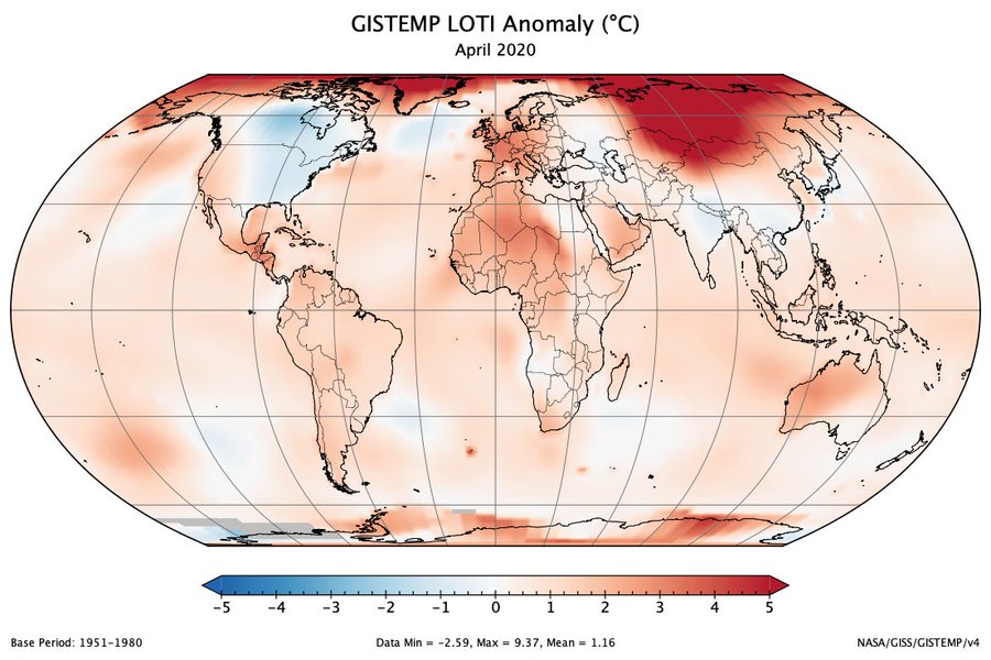
Their analysis of global climate data showed the planet is heating up unevenly. Globally, average temperatures are a little more than 1 degree Celsius (1.8 degrees Fahrenheit) warmer than in the preindustrial era. But roughly one-tenth of the world’s surface area has already experienced 2 degrees Celsius of warming — an amount that U.N. scientists say will trigger dangerous climate impacts. In the United States, more than 70 counties have passed that threshold.
and not just here, but in prior articles too. Of course this is ridiculous not only in degree, but in kind. A warming of 2.06°C (say) isn't any more dangerous than 2.00°C, not really, given the uncertainties involved, which they don't seem to want to acknowledge. Uncertainties don't make the evening news.

But beyond that, "2.0°C" isn't any kind of magic line. It was chosen -- and I once asked several IPCC-ish scientists about this for something I was writing, many years ago -- out of convenience. 1°C seemed too small, and 3°C seemed too big. So 2°C it was. It was that simple, and, really, that simple.

But that hardly means 2°C anywhere is as dangerous as 2°C globally. WaPo is continually confused about this, too, from what I can tell over the years.

We can get a good approximation for land warming, WL, by noting a few simple, approximate relationships:

AGWG = AOWO + ALWL

where A=area, W=warming, and G=global, O=ocean, L=land. (Am I good here?) For Mama Earth:

AO = 361.1 Mkm2
AL = 148.9 Mkm2
AG = 510.1 Mkm2

From NOAA:
WG = 1.05°C
WL = 1.62°C
WO = 0.85°C

which look more accurate than they really are, once you include uncertainties. So if WG = 2°C, WL = something like 3.1°C. And this is a global average; there's a lot of deviation by latitude. 

So just because some place on land exceeds 2°C of warming -- or 3.1°C -- doesn't mean it's suddenly dangerous-look-out-dive-for-the-shadows red flashing sirens. Please.

Friday, May 22, 2020

Friday Night Music: Kasey Chambers, Changed the Locks

I don't know about you, but I am feeling the negative effects of the quarantine. I didn't have a lot of friends around here pre-pandemic, and now that's ten times worse. I've been Zooming with some friends scattered all around the country, as it goes these days, but that only goes so far.

A Fantastic Photograph from New Hampshire

Taken at 2 am at Chocorua Lake in New Hampshire, by Jim Diamond. I just love the clear reflection of stars in the lake.... Rural New Hampshire certainly has an amazing nighttime sky.

Image may contain: sky, outdoor, nature and water

Very Well Put

COVID-19 Changes in the Past Week

I found a few states surprising: Georgia, South Dakota. The states with increases are about what I would expect, especially Texas, Oklahoma, Michigan and Wisconsin. Note Michigan is still under lockdown, but their number of cases is still going up. Maybe more testing, but you have to wonder if some of it isn't all the maskless protesters. (So apparently big guns and silly camo don't stop the virus.) This image isn't dynamic -- you can't hover over the states for data -- but you can at the original at Axios.


Tuesday, May 19, 2020

More Metrics of COVID-19 in Wisconsin

Here are some more graphs of the coronavirus situation in Wisconsin. Things don't look as dire as I might have thought, at least not yet. If I lived there, though, I wouldn't leave the house except for essential things like groceries, dry cat food, wet cat food, and cat litter. You definitely don't want to run out of cat litter.


The sudden increase at the start here is apparently when data on hospitalized began to be recorded, not a sudden jump in the first hospitalized:


Monday, May 18, 2020

When You Have a Reasonable Supreme Court

Oregonian: "Oregon Supreme Court puts hold on Baker County judge’s ruling declaring governor’s coronavirus orders ‘null and void,’" -- State Supreme Court Presiding Thomas A. Balmer, in a three-paragraph ruling issued at 7:45 pm., granted the state’s emergency motion.
In a late Monday night ruling, the Oregon Supreme Court stepped in to put a hold on a dramatic decision by an eastern Oregon judge that declared not only Gov. Kate Brown’s restrictions on church gatherings but all her “Stay Home Save Lives’’ coronavirus emergency orders “null and void.’’
Baker County is in easternmost Oregon, almost in Idaho. Certainly very red. To be fair, there looks to be very, very few COVID-19 cases out there. Of course, the governor's aim is to keep it that way.


Mt St Helens Pictures and Video

Mt St Helens erupted 40 years ago today; 57 people died, many of them obligerated. Yesterday a journalist had an op-ed in the NY Times about his coverage of the eruption. It was tied into the pandemic, which at first I thought was going to be forced and hookey, but it turned out not to be and is worth reading.

Here are some of the video and pictures from the time. I heard yesterday that the Cascade Mountain volcanoes erupt, on average, twice a century, so maybe another one is coming up soon. (I think I've heard that the most likely to erupt next is Mt Hood, just east of Portland.)

This is longer, made for an awards application:

As seen from Portland, Oregon, about 50 miles to the southeast:

Pin on Volcano!
Most of the ash went to the northeast and some was then carried south:
Mt St Helens
Here are a few interesting pictures from the Spokane Review, which you see above was on the edge of the major ash cloud and close in:


I remember seeing some ash on cars in western Pennsylvania -- the semester had ended at Stony Brook and I took a quick train trip back to see my grandparents and extended family. But it was a very thin coating, like a heavy sprinkle; we get pollen coatings here in Oregon that are worse. But being in graduate school then I wasn't paying much attention to the news, except what I read in the NY Times or Time magazine, so I didn't have any of the excitement that television conveyed.

Sunday, May 17, 2020

Wisconsin COVID-19 Cases Still Increasing Exponentially

I used data from this page, up to May 16th. And remember, it's going to take awhile for new cases from reopening to show up, perhaps two weeks.


When all this is over -- or at least calmed down -- there needs to be serious thought given to who has what powers in a problem like this, and who enforces it and in what ways, and what happens to people who flaunt the restrictions. What if the next pandemic virus is even more infectious than this coronavirus? Rights aren't absolute and this is a matter of life and death in an emergency like a pandemic, whether some people can't understand that or not.

Wisconsin. Poor Wisconsin.

I don't remember now exactly where I found this graph, but it shows that COVID-19 cases in Wisconsin were increasing exponentially when, last Wednesday, their Republican dominated state supreme court decided, on a teleconference from the sequestered safety of their homes, that the state should be reopened immediately, without any plan to safely do so. Just let the herd out. Sure enough, (some) Wisconsinites immediately took to their bars and taverns. USA Today wrote:
The Tavern League of Wisconsin, a trade association of alcoholic beverage retailers in the state, posted on Facebook shortly after the ruling that, while guidelines should be followed, "you can OPEN IMMEDIATELY!"
"We’re the Wild West," Wisconsin Governor Tony Evers said. He had been trying to protect his people, something Republicans can no longer abide.

I haven't seen any data since. I find it difficult to find timely raw data for cases and deaths for states as a function of time. Anyone know a good source?

Added: this site isn't bad for state historical data, though you have to wrestle with the daily data.

Saturday, May 16, 2020

Scary Account of Two Young Adults With COVID-19

Scott Denning is a climate scientist at Colorado State University. I don't know him personally, but we've had several good conversations on the phone when I've had questions -- his specialty is the carbon cycle. He's been very generous with his time. On Facebook he posted this account of his adult children's experience with COVID-19. Well worth reading; it's quite scary, especially if you're not a young whippersnapper anymore, and, as this account attests, even if you are. Note that neither of these people were counted in the numbers being used to measure the pandemic.
---
Scott Denning is with Madison Denning and Nate Denning.
As many of you are aware, both my kids got sick in April with COVID-19. I want to share their experience so you get an idea of what it's like for patients with very low risk.

Nate is 26. Maddie is 22. Both were robustly healthy before getting sick, and both became extremely ill from the virus.

Maddie works at a supermarket and was almost certainly exposed to the virus at work. This is what we mean by "essential workers:" the ones who are virtually certain to get exposed because (a) their jobs must be done no matter what; and (b) they don't have a job that can be done from home. Nate probably picked up the virus from Maddie when they visited each other a few days before Easter.

Both kids initially reported flu-like symptoms: cough, body aches, headache, fatigue. Neither ever developed a fever. After several days of worry but nothing too serious, each of them got much much worse (Nate about a week after Maddie).

Maddie had one very bad sleepless night where breathing was quite difficult and then several days of painful lungs and wheezing. Thankfully, she then started improving and was symptom-free about a week later.

Nate had a more difficult time. He developed burning lungs and had a very hard time breathing, for many days and nights. He couldn't get his blood oxygen above 88, and he could barely sit up in bed. Eating and going to the bathroom were very difficult for about a week. We talked with him every day on the phone, and it was like talking to somebody running a marathon. He wheezed and gasped about every two or three words. It went on and on and didn't get any better though thankfully neither did it get much worse from there.

He was scared. We were scared.

Both kids contacted our family physician when they first came down with symptoms. Both were diagnosed via "telemedicine" (over the phone) and neither were offered a SARS-CoV-2 test. I'm pretty sure neither is counted as one of the "cases" in Larimer County, because they were not tested. Makes me wonder about the case counts we see on the internet.

Both kids were very strongly discouraged from visiting the doctors' office. Each was told to go to the ER if they took a sudden turn for the worse. Each was told that if they didn't improve on their own they could receive a prescription for a steroid inhaler to make breathing easier by reducing inflammation.

Testing, hospitalization, and even inhalers are not being used in northern Colorado for low-risk patients like my kids. They are still scarce enough that they are reserved for more serious cases.

Nate called in several more times during the course of his illness and was eventually prescribed the inhaler, about two weeks into the disease. This was after almost 10 days of being extremely ill, certainly the most severe illness of his life up to now.

The inhaler relieved his lung inflammation dramatically, to the point that he immediately was able to get his blood oxygen above 90 and he began to recover quickly. Within three days of starting the inhaler he was pretty much completely recovered.

As some of you know, Nate was nearly killed in a horrific car accident 10 years ago, when he was 16. At that time, he spent 3 weeks in the hospital with a broken spine & pelvis and then three months in a wheelchair. He now says his bout of COVID-19 was about as bad as the recovery from the car accident, maybe worse.

Like almost everyone who gets COVID-19, my kids both survived. Unlike some, they are both pretty much back to normal -- that is, to the robust good health that most 20-somethings take for granted. Of course they were both very low-risk to begin with.

We are very grateful!

Having watched the virus ravage these two healthy young people, I can't help but think how much worse it's likely to be for me or Jennifer, or for friends our age. Or for people who are older or sicker than we are.

Please take precautions to keep yourselves and your loved ones healthy. It's true that some people have mild or even nonexistent symptoms of this disease. It's also true that many people considered to be at low risk will develop extremely serious, even life-threatening illness.

And when you pick up your groceries or get them delivered, think about the millions of minimum wage heroes toiling away day and night in masks and gloves behind the scenes, risking a terrible illness to keep the milk flowing!

Global Warming Now Up to 1.1 C

ImageNASA GISS reported their temperature anomalies for April yesterday. The globe was 1.16°C above the 1951-1980 average, the warmest April in their records. Relative to the 30-year period 1880-1909 it was 1.41°C.

The northern hemisphere's April was the 2nd highest, southern hemisphere's was highest, and the land-only April anomaly was warmest at 1.56°C (relative to 1951-1980; 1.91°C relative to 1880-1909.)

To two significant digits, NASA GISS's total global warming now rounds to 1.1°C. Gavin Schmidt says 2020 is not now virtually certain to be a top 3 year (since 1880) and the 6th consecutive year with an anomaly greater than 1°C.
--
NOAA found April to be the 2nd warmest of all Aprils since 1880, the same period as GISS. Their total warming also now rounds to 1.1°C.

Meanwhile the Japanese Meteorological Association (JMA) found April 2020 to be only the 2nd warmest April, after only 2016. Their total change since 1891, a slightly shorter period, is 0.97°C. (But I don't think that one decade, 1880-1890, fully accounts for their 0.08°C difference in warming from GISS -- it more likely something different in their methodologies (that's not to say who's "right" and who's "wrong," just choices.))

Monday, May 11, 2020

When Might New Cases Begin to Change With Reopening?

Like you I've been wondering when new Covid-19 cases will show up, if at all, from the various states reopening before public health experts suggest, and from truly insane numbskulls crowding into ice cream stores without even wearing a mask.

There's a time lag before they appear, but how much? This CNN article from May 5th provides some good information: "We won't know the impact of states reopening for weeks. Here are several reasons why."

They lay out the various delays between reopening and new cases start to appear, and give estimates for each delay:

time to notice new cases [deaths] = (incubation period) + (minor illness period) 
+ (test result period) + [(time to death)]

 = (2-14 days) + (a few days) + (a few days) + [(3 weeks)]

Let's take "a few days" to be 2 to 4. Average is 3 days.

So taking the average of the first three intervals above, we get about 14 days, or two weeks. About five weeks until new deaths would be noticeable.

There isn't any exact time of reopening -- it varies by state, and it varies by degree, that is, how much of the state's economy was reopened: just beaches, does it include restaurants, salons, saloons, tattoo parlors, etc. Do these places require masks and some form of social distancing? A temperature gun pointed at your forehead? Etc.

But two weeks would seem to be the minimum time before new cases would begin to show up, and even then it might be too small to notice. Just eyeballing it, perhaps additional new case will be noticeable by the end of May? But by then the first wave will have presumably declined more, temporarily hiding the beginning of the second wave.

Below is the current status (for the US), from worldometer. There's been a definite decline in new cases since about April 25th. It'd be a shame if that trend were to reverse. What's worse, economically -- another month or two of strict quarantine, or a virus that lingers for months and months, maybe reviving in the fall and winter. I understand some people and businesses are experiencing terrible stress financially. But another two months, and a plan to protect the elderly and immune-compromised, and much more testing and contract tracing, is far better than another Great Depression. I like the Democrats idea of giving $2000/person for another couple of months. But Senators like Lindsay Graham don't like because, as Business Insider wrote, he thinks it "would incentivize people to stay at home rather than return to work, to the detriment of small business owners." (But they'd still have money to spend.(?)) Graham said "he and his colleague Sen. Tim Scott [R-SC] would allow a $600 per week pandemic unemployment benefit to extend past July 'over our dead bodies.'" But he's fine with putting the risk on your dead body.

Trump has no plan as far as I can tell. No plan to protect the vulnerable, to ramp up testing, to ramp up contact tracing. Nothing. We're storming the beaches at Normandy after being dropped off in shorts and a t-shirt, with nothing but a cooler of pop and bologna sandwiches.

United States

Saturday, May 09, 2020

We're Officially in a Weak El Nino

That is, according to the Oceanic Niño Index (ONI), the 3-month running mean of ERSST.v5 SST anomalies in the Niño 3.4 region (5°N-5°S, 120°W-170°W)].

5 consecutive months of ONI ≥ 0.5 is considered to be an El Nino. The last five months have barely slipped under that line:


It's not quite as strong as last winter's El Nino, but it does help explain why this winter's temperatures are or are bordering on new highs. (But not why they're on par with, or exceeding, the winter of 2015-2016's El Nino.)

And if this was a significant El Nino, we wouldn't be seeing record breaking ocean heat content.

Thursday, May 07, 2020

Excluding NY City, US Cases are Increasing

This is from yesterday's NY Times:


Excluding New York City:


Also excluding two other hotspots, Detroit and New Orleans:


Something similar in Texas and Oklahoma:


Someone in the comments makes a point about different rates of testing -- it doesn't seem possible to link to it:

The second paragraph explains why there might be more cases in cities, especially dense cities like NYC, but I don't see how the first paragraph changes the overall picture. Granted that the cities have seen more testing and therefore more cases...but if the rest of the country (excluding NYC, etc) had the same testing rate as NYC etc they'd see more cases too. Maybe not more at the same proportion, but more. So it's not obvious to me the second graph can be easily explained away. 

Tuesday, May 05, 2020

Key West Sea Level Rise: 3.8 years/inch

In Key West, Florida, sea level has been rising an inch every 3.8 years over the last twenty years, on average.


Data through March 2020.

Monday, May 04, 2020

Startling New Secret Numbers

Secret Trump administration coronavirus numbers leaked to the NY Times are really horrifying:


In other words, Trump foresees opening up the economy and completely giving up on containing the virus. The situation is going to get worse that it was at it worst so far -- US cases per day peaked at about 35,000/day and deaths at about 3,800/day (for one day). (I'm leaving out anomalous days when a tranche of new cases or deaths was found and added all in on one day.)

I don't understand this at all. I mean, why does Trump want to open up only to make things worse than before?

Friday, May 01, 2020

Welfare Music

Something different, by the Bottle Rockets:


Trump's Model of the Coronavirus

He presented it yesterday. Reporter:

Trump:

(from the monologue to Steven Colbert's show last night)

Trump has got to be the world champion at the Dunning-Kruger Contest. Got to.

Fauci, and Temperatures

An interesting article article on how Anthony Fauci inspired some hope simply by presenting the results of the scientific method, and how Trump seems to disdain it.

UAH's lower troposphere for April: 4th warmest April, 46 warmest month (of a total of 497). The linear trend now rounds to 0.14°C/decade.

Ocean heat content for the first three months of 2020 set a record for both the 0-700 m region and the 0-2000 m region. Last year the 0-100 m region also set a record (it's only calculated once per year), finally surpassing the El Nino year of 2016).


The Hadley Central England Temperature, a measurement of about 1 cm3 of air, saw its 5th warmest April in 361 years of record-keeping. Caveat: Many of the early decades of this record aren't considered robust.

"Robust" is science slang -- it basically means good, in all the ways that a model/experiment and its data can be good: accurate, precise, reproducible, smells good, trims its nails, etc. We should trust it and like it (until a better model/experiment and data comes along).

Finally, the South Pole -- also presumably measuring about a cc of air -- had its 6th warmest April, with records there starting in 1957. The data aren't very linear, so I'm gonna be good for once and resist providing a linear trend. 

Click for clarity