Saturday, July 26, 2014

Glad Someone Finally Said It


Via Talking Points Memo. Crist is running (again) for governor of Florida.
On Friday, Crist reportedly attended a 25-minute presentation by Jeff Chanton, a professor at Florida State University who specializes in chemical oceanography and has offered to meet with Scott. Chanton discussed rising sea levels as a consequence of climate change, which scientists say threatens Florida's infrastructure and real estate near the coastline.

Scott's campaign dismissed the move as a publicity stunt, per SaintPetersBlog.

Wednesday, July 23, 2014

Miami Residents Discover Climate Change Costs Money

Flooding in Miami BeachFrom the Department of You-Will-Pay-For-Climate-Change-One-Way-Or-Another:
Miami Beach is proposing an 84 percent increase in storm water fees — the cost of keeping rising seas at bay — with more rises in the future.
(source: Miami  Herald). Total expected cost: $300 million.
The city hopes to pay for infrastructure projects, which include pumps to suck water out of soggy streets. About $30 million in storm water improvements are already approved. Plans call for 65 new pump stations and improvements to 21 existing wells.

“It’s just essential,” Commissioner Joy Malakoff said at a committee meeting.

Sunday, July 20, 2014

Models That Predict the Pause

There's a very interesting paper out today in Nature Climate Change:
"Well-estimated global surface warming in climate projections selected for ENSO phase," James S. Risbey, Stephan Lewandowsky, Clothilde Langlais, Didier P. Monselesan, Terence J. O’Kane & Naomi Oreskes, Nature Climate Change (2014).
What they found is that those climate models that, by chance, reproduce ENSOs since 1950, do show a slowdown in surface warming for the 1998-2012 period.

Climate models make projections, not forecasts. They calculate climate over long time periods -- a few decades at least -- due to forcing variations, but aren't good at projecting internal variability like ENSOs and the PDO which take up or release heat (and which average out to zero over many decades). Slowdowns ("pauses") occur in the 15-year trends in the models, but forecasting one from, say, 1998 requires setting up a model with its ocean in that particular ENSO state.

Here, for example, is a histogram of all the model projections for two 15-year periods. Most models overpredicted the last 15 years, but overunderpredicted the previous 15 years (which I've called the anti-pause):


This group looked at all CMIP5 models, and culled all except for models whose internal variability was, by chance, close to the Nino3.4 surface temperature:

.To select this subset of models for any 15-year period, we calculate the 15-year trend in Niño3.4 index24 in observations and in CMIP5models and select only thosemodels with aNiño3.4 trend within a tolerance window of 0.01K/yr of the observed Niño3.4 trend. This approach ensures that we select only models with a phasing of ENSO regime and ocean heat uptake largely in line with observations. In this case we select the subset of models in phase with observations from a reduced set of 18 CMIP5 models where Niño3.4 data were available25 and for the period since 1950 when Niño3.4 indices are more reliable in observations.

Then here is their result:


So the in-phase models projections are very close to the bottom of the all-model spread. It's not perfect, as they note:
This method of phase aligning to select appropriate model trend estimates will not be perfect as the models contain errors in the forcing histories27 and errors in the simulation of ENSO (refs 25,28) and other processes. Further, ENSO is not the only process generating natural variability on these timescales and so the method used here can be only approximate. Nonetheless, the phaseselection method provides a fairer and more appropriate basis to compare model projection trends over decadal-scale periods than use of the entire multi-model envelope. When the phase of naturalvariability is taken into account, the model 15-year warming trends in CMIP5 projections well estimate the observed trends for all 15-year periods over the past half-century.

Saturday, July 19, 2014

Fire Tents and Oregon Fires

This video piece about fire tents and how they saved the lives of one crew was a lot more captivating than I expected:


Fires are in the news here a great deal right now.

Besides A River Runs Through It, Norman Maclean wrote an interesting book titled Young Men and Fire, the story and an analysis of the 1949 Mann Gulch fire that killed 13 people (there were only 3 survivors). Realizing they were in trouble, the firefighters raced up a steep (38°) mountainside in front of the fire; four of them made it, but only two were able to crawl though the rock ridge at the top. (Wildfires burn exceptionally fast going up hill, because the heat of the towering flames is closer to the upslope than it would be to flat ground, which pre-heats the upslope so it combusts more quickly.)

Once he realized he and several others couldn't outclimb the fire, the crew's Foreman, Wagner Dodge, famously lit the grass right in front of them and encouraged those near him to lie down in the burnt area. It was no doubt hectic and terrifying, and the others didn't realize what Dodge was doing, and they dismissed him and kept climbing. All those who ran away from Dodge's "escape fire" lost their lives, while Dodge laid in the burnt area and the main fire went around him.

Anyway, the last of the three survivors, Robert Sallee, just died a few weeks ago, which brought the book and the fire back to my mind.

Dodge's escape fire was controversial afterwards. He said he invented the idea on the spot, as it seemed "logical" to him (but maybe he had talked about it some years earlier). A lot was learned from this particular fire that was incorporated in firefighters' training.

I just noticed that Maclean's son, John Norman Maclean, wrote a book, Fire on the Mountain, that told a similar story about the South Canyon Fire on Storm King Mountain on July 1994 in Colorado, where 14 firefighters lost their lives. I find these stories fascinating, perhaps because they are so terrifying.

Fires are in the news here because Oregon has many burning right now, with five that just started yesterday and are large (69,000 acres) and uncontained. It's so bad the governor declared a state of emergency on Wednesday. One fire has already burned 576 square miles and is 20% contained, and another has burned 262 square miles and is 0% contained. Those two alone are 70% of the size of Rhode Island.

"Curiosity" by Rob Pyle

In the mail: Curiosity: The Inside Look at the Mars Rover Mission and the People Who Made It Happen, by science writer Rob Pyle.

Personally, I thought the landing of the Curiosity Rover on Mars in August 2012 was as exciting as anything fror the Apollo missions, including the first landing on the Moon (whose 45th anniversay is tomorrow). (Video is here.)

Maybe more so. Being on the Web instead of a grainy view on a black and white television made it much easier to share in the drama, I wasn't 9-years old and sleepy (Neil Armstrong stepped onto the surface of the Moon at 10:56 pm Eastern Time) after being keyed up all day knowing what was coming, I've been at JPL to interview Steve Squyres about the earlier rovers and had seen where and how they work, and the next morning I got to interview the lead scientist, John Grotzinger, even though he'd been up all night and had to be drained.

Maybe I'm just a kid at heart, but I still get goosebumps when the JPL guy says "We're safe on Mars" and the anxious room explodes into cheers and high-fives.

So I'm sure I'll find Pyle's book interesting. It has behind-the-scenes stories, delves into the scientific reasons for the mission, and technical details on how the rover was built.

It's be a great gift for a high-schooler who is into science, and better yet, space. Are there any such kids anymore, or do they all want to work at Google instead of NASA or SpaceX? My 9-year old nephew doesn't seem aware of space travel at all, even though I've given him a couple of books on it. Are any 9-year olds nowadays?

Don't at least a few of them want to go to Mars? This book would be a good start.

Thursday, July 17, 2014

Updated El Nino Review & Forecast

The International Research Institute for Climate and Society at Columbia University is out with their monthly climate review and ENSO forecast:
During June through early-July the observed ENSO conditions remained near the borderline of a weak El Niño condition in the ocean, but the atmosphere so far has shown little involvement. Most of the ENSO prediction models indicate more warming coming in the months ahead, leading to sustained El Niño conditions by the middle or late portion of northern summer.
There is a wide spread in what models are now forecasting, with none higher than a Nino3.4 anomaly of 1.6°C. (The 1997 anomaly reached 2.9°C.)


Here's my update comparing the 1997-98 El Nino to this year's fledgling attempt at an El Nino. This year's Nino3.4 index is fading for now, but it's notable that temperatures this year have, El Nino or not, so far been signficantly ahead of 1997's (by an average of 0.25°C).


By the way, here are the different Nino regions of the Pacific ocean:

Niño Regions

Australia


Via Imgur.

Nikola Tesla and the Pigeon

This Tesla item is from the Perimeter Institute, in Canada -- "What Great Scientists Did When they Weren't Doing Great Science." They have several more here.

One they didn't mention, but that I particularly like, was Arthur Eddington's method of tracking lifetime cycling progress -- the largest integer N such that one had cycled at least N miles on N different days.

He got up to at least N=77, which he reached at the age of 60.

Some people call this the "Eddington Number," which is funny because Eddington is known for (among many other things) his interest in the fine structure constant α, which he claimed was exactly equal to 1/136, and for his calculation that the exact number of protons in the universe (with an equal number of electrons) was NEDD = 136 × 2256 ∼ 1079, or, as he said in a 1938 lecture at Cambridge:
"I believe there are 15 747 724 136 275 002 577 605 653 961 181 555 468 044 717 914 527 116 709 366 231 425 076 185 631 031 296 protons in the universe and the same number of electrons."
Later, when α was experimentally found to be closer to 1/137, Eddington changed his "proof" to claim that α had to be exactly 1/137, for which Punch magazine dubbed him "Sir Arthur Adding-One."

Wednesday, July 16, 2014

Calling Politicans' Bluff

Here's how you do it:
TALLAHASSEE — In an effort to push Gov. Rick Scott into the debate on climate change, 10 prominent Florida scientists on Tuesday asked for an opportunity to explain to him the impact human-induced global warming will have on Florida.

"We note you have been asked several times about how, as Governor, you will handle the issue of climate change," the scientists wrote in a two-page letter to Scott. "You responded that you are 'not a scientist.' We are scientists and we would like the opportunity to explain what is at stake for our state."
via the Tampa Bay Times/Herald, which also has a copy of the letter at the end of its article.

If politicans give you lemons, make lemonade. Meet them on their home turf. Two can play at this game. Never up, never in. The best defense is a good offense. Etc.

Monday, July 14, 2014

Putting Elephant Seals to Work for Science

Clever -- in the Southern Ocean, scientists are using elephant seals like Argo buoys, attaching tags to the seals that record temperature, salinity and pressure, that they send via satellite when the seal surfaces. Here's a paper where they used these data to improve understanding of the deep ocean circulation in the Southern Ocean.

They say the tag is put on their head with a harmless glue that comes off when the animal moults.

Here are some tags on their back flippers. I think I'd prefer that, but am not totally sure.

The Internet of things now includes elephant seals. Squirrels can't be far behind.

Wednesday, July 09, 2014

What Good is it to Save the Planet....

"What good is it to save the planet if humanity suffers?"

-- ExxonMobil CEO Rex Tillerson, May 2013

from "The Turning Point: New Hope for the Climate," Al Gore, Rolling Stone, July 3-17, 2014.

Hadley Sea Surface Temp Breaks Record

The Hadley global sea surface temperature anomaly for June is +0.562°C, the highest in their dataset, which goes back to 1850. (Not just the highest for June, the higher ever, beating the old record of July 1998 by 0.036°C.)

Monday, July 07, 2014

New Rules For Temperature Trends

1. If you don't trust the temperature data, you can't use it to deduce something like a "pause."

2. If you're going to cherry pick your data set (RSS), and your starting year, to show a "pause," you have to acknowledge the "anti-pause" that happened from 1998 to 2008, where the "18-year" trend was greater than the canonical 0.2 C/decade.

When David Rose Admitted to Being a Tool

David Rose covered the war in Iraq when he was at the London Observer. In this 2010 documentary, "The War You Don't See," he admits to being duped by disinformation campaigns advocating for the war, saying he later was "nauseauted, angry and ashamed."
"...the facts that I believed to be true in those articles were not true, they were a pack of lies fed to me by a fairly sophisticated disinformation campaign.... I should have been more skeptical."


Does that experience explain, or feed, Rose's extreme climate contrarism?

El Nino Looks to Be Fading Away


Data source.

Monday, June 30, 2014

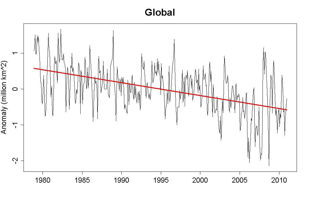
Ice Is Properly Measured by its Volume, not Area

Tony Heller (was "Steve Goddard") is hawking the growth in Antarctic sea ice extent as, I guess, a proof against manmade warming. Like lots of them do.

Perhaps when he goes to a store to buy ice they price it by the square foot, but everywhere I've been they price it by the pound.

First of all, the evidence for AGW is so overwhelming that the growth of sea in the Antarctic is something to be explained in the context of AGW, not proof against it.

It's a complicated continent, very different from the Arctic -- one a continent surrounded by water, the other water surrounded by continents. The NSIDC has a good page on the differences:
The Antarctic is almost a geographic opposite of the Arctic, because Antarctica is a land mass surrounded by an ocean. The open ocean allows the forming sea ice to move more freely, resulting in higher drift speeds. However, Antarctic sea ice forms ridges much less often than sea ice in the Arctic. Also, because there is no land boundary to the north, the sea ice is free to float northward into warmer waters where it eventually melts. As a result, almost all of the sea ice that forms during the Antarctic winter melts during the summer. 
(plus more -- read the entire page).

Some think the growth is due to shifts of winds in the southern hemisphere, or increased snowfall on the Southern Ocean, or (Manabe et al's 1992 prediction) an increased supply of water at the near-Antarctic ocean surface that could slightly lower sea surface temperatures. Or there might  be a problem with the data model. There doesn't seem to yet be a consensus.

Secondly, ice is measured by volume, not area, because for a given amount of heat, the melting rate varies as the mass changes, which is proportional to the volume change, not the area change. At the risk of being pedantic, recall from high school physics

ΔQ = Hf Δm

where ΔQ is the heat added to the system, m is mass, and Hf is the heat of fusion (334 kJ/kg for ice).
m = density*volume, so
ΔQ ∝ ΔV

(∝ means ("proportional to"). But (being even more pedantic), ΔV is not proportional to the change in area, but (for, say, a block of area A and height h, so V=Ah)

ΔV = hΔA + AΔh

so the change in volume is not proportional to the change in area, but a linear combination of the change in area and the change in height.

This is why, in a warming context, it's accurate to talk about sea ice volume, not sea ice area or extent. The downside, of course, is that we have daily measurements of sea ice area and extent, but only modeled results for sea ice volume. People follow extent because it's the only metric we have, except when papers come out with volume numbers.

Although global sea ice extent is, at the moment, back around 1985 to 1990 levels (though the trend is definitely down), global sea ice volume is much lower than then: PIOMAS calculates Arctic sea ice volume to be decreasing by 260 gigatonnes per year, while Antarctic sea ice is increasing by only 26 Gt/yr.

Arctic sea ice is melting 10 times faster than the Antarctic is gaining sea ice. The Earth is now losing over a trillion tonnes of ice a year.

When talking about warming, viz. the energy imbalance of the Earth, the volume of ice is the appropriate metric, not its area.
#GoddardGate

Sunday, June 29, 2014

Monday, June 16, 2014

El Niño is Fizzling

The once-burgeoning El Niño looks to be fizzling out -- the latest Niño3.4 SST anomaly has dropped out of the lower border of El Niño territory (≥ 0.5 C):


Maybe it's too soon to call it a complete failure...so keep your party hat on for another week or two. But for now, someone turn the music down, OK?

Saturday, June 14, 2014

Relative Population by Latitude


from Imgur

When Have 17-year Trends Been Significant?

Earlier I found that the 17-year trend of HadCRUT4 has been statistically significant only 49% of time (with lag-1 autocorrelation) since it began in 1850.

Here are those times -- when that trend has been statistically significant at the 95% confidence level, and the value of that trend.


At the present time, this particular trend is not statistically significant, with this level of autocorrelation factored in, and it hasn't been since March 2013. (I find that, instead, its ss=85%.)

Friday, June 13, 2014

Krugman on Models

"Suppose that you’re making a prediction — and every assertion about how the world works has to involve at least an implicit prediction of something, because otherwise it’s empty. This prediction comes from some kind of model — if you don’t think you have a model, you’re kidding yourself, and your model is all the worse because you imagine that you aren’t using it."

-- Paul Krugman, NY Times

Tuesday, June 10, 2014

UAH Lower Troposphere: Warmest 10-year Period on Record

UAH's May anomaly for the lower troposphere is +0.33°C, the 3rd-warmest May in their records.

It also makes the last 10 years (120 months) the warmest in their records (error bars excluded):


Here is UAH compared to RSS, adjusting the latter to have the same baseline:


Over the last 12 months, UAH has been an average of 0.12°C above RSS. Roy Spencer says a new version of UAH's model will very slightly reduce their anomalies in the second half of their record, making them slightly more RSS-like.

Sunday, June 08, 2014

More on the Significance of Temperature Trends

I expanded on my post of the other day to include first-order autocorrelation when calculating linear temperature trends.

Not surprisingly, the percentage of times the HadCRUT4 temperature series is significant, for any interval of N years, dropped significantly:


Even, for example, some 60-year linear trends aren't signficant at the 95% level -- the last being December 1877 to November 1937, when it did a U-turn about 1910. The statistical significance of that 60-year interval is 93.7%.

BTW, a useful and easy-to-read introduction to calculating trends and their uncertainities is Statistical Issues Regarding Trends by Tom Wigley.

Thursday, June 05, 2014

How Often is a Temperature Trend Significant?

I've finally learned enough Python in my spare time to calculate something I've wanted to do for awhile: begin to answer how often past temperature trends have been signficiant.

That is, if you calculate the all possible N-year linear trends for a dataset, how often are their statistical significance 95% or higher, for all N?

Not as often as you might think.

I used HadCRUT4 surface data, which begins in January 1850. So for N=2 (2 years), you can calculate a linear trend from 1/1850 to 12/1851, from 2/1850 to 1/1852, from 3/1850 to 2/1852, etc., up to 24 months before the present.

Of these 1,949 trends for N=2, how many have been statistically significant at the 95% level?

50%, if you don't include any autocorrelation. Obviously, with autocorrelation it will be smaller, because the error bars on the trend will be bigger.

I did this for N from 2 years to 99 years. Here's my result:


So 10-year linear trends of HadCRUT4 have only been statistically signfiicant 65% of the time. 20-year trends 76% of the time. Etc. (This assumes, as usual, that the residuals of the linear fit are normally distributed.)

And, mind you, this is without any autocorrelation factored in, not even rank-1 autocorrelation between a temperature point and its nearest neighbor, let alone the exponential decay method of calculation autocorrelation described in Foster and Rahmstorf (2011) and used by the Skeptical Science trend calculator.

I'll get to those soon. But in the meantime, even this basic calculation shows that talking about 10- or 15 or 18-year trends, like Werner Brozek likes to do at WUWT, is meaningless, just mindless numerology.

Nor, of course, is there anything magical about 95%. It means the result is significant to about 2 standard deviations, and it's the common benchmark for medical studies, but high-energy physicists (say) often more, as, for example, the 5-sigma requirement for the discovery of the Higgs boson. In climate science, which isn't an experimental science (viz. you can't do as  many repetitive experiments as you want), you can't get that kind of data -- you take the data you can get. So like we're supposed to take action if a warming trend is 96%, but not if it's 94%,or 80%, or 60%? That's absurd, of course.

Numerology is not a substitute for thinking. And short intervals are not meaningful.

Wednesday, June 04, 2014

You Are Traffic

Comment at the Oregonian:
"You are not stuck in traffic, you are traffic."

Monday, June 02, 2014

Map of Tropical Cyclones

I just like this map, so am posting it. It's from "Shifting storms," by Hamish Ramsey, a News & Views story in the May 15th issue of Nature, which highlights a study that found the maximum intensity of storms is shifting poleward by about 1° latitude per decade, over the last 30 years.

Sunday, June 01, 2014

Mayor Can't Think About Moving His Whole City Due to Rising Sea

From a Washington Post article on rising sea-level in Norfolk, Virginia:
"'We don’t like being the poster child for climate change,' said the Rev. Jennifer Slade [of the Unitarian Church of Norfolk].... 'I don’t know many churches that have to put the tide chart on their Web site' so people know whether they can get to church."
Norfolk sits on the east coast sea-level hotspot, where land subsidence of 0.12 inches a year (3.0 mm/yr) is adding to the global rise of the ocean. The mayor is, for now, avoiding the hard questions:
Put it all together, as VIMS (Virginia Institute of Marine Sciences) scientists did when they were asked by the General Assembly to study recurrent flooding in tidewater Virginia, and models suggest tides ranging from 1 1/2 feet to 7 1/2 feet higher by 2100.

Five and a half feet represents “business as usual,” a vision of the future without “significant efforts by the world’s nations to curb greenhouse gases,” the report said. “Recent trends in Virginia sea levels suggest we are on [this] curve.”

Larry Atkinson, an oceanographer who is co-director of the Climate Change and Sea Level Rise Initiative at Old Dominion University, said when the mayor was asked about the report, he waved away the question. “He says, ‘I can’t think about five feet. What do you want me to do, move the whole city?’ ”
Yes, some parts of the city will have to be moved. Or just abandoned.

In some places, adaptation is going to get ugly, and people are starting to get that.

Wednesday, May 28, 2014

Obama's Proposal Equivalent to Only 6% Cut in Total CO2 Emissions

President Obama is going to propose CO2 cuts of up to 20 percent from coal-fired power plants. NY Times:
WASHINGTON — President Obama will use his executive authority to propose a global warming regulation that would cut carbon pollution from the nation’s coal-fired power plants by up to 20 percent and pave the way for the creation of state cap-and-trade programs without having to go through a reluctant Congress, according to people familiar with the rule.
That sounds big, and getting rid of 20% of coal in the U.S. would be a significant first step, but the CO2 problem is so large the overall impact isn't that impressive.

In 2013 the U.S. emitted 5,393 megatonnes of CO2 from burning fossil fuels, according to the EIA. Of that, 1,722 Mt was from burning coal.

So a 20% maximum reduction in the latter is only 344 Mt, or 6.4% of the total, maximum.

And it's about 1% of global emissions.

6% is much better than nothing. Do it 16 times and you're almost down to zero. But it just shows how enormously difficult it is to make climatologically meaningful cuts in carbon emissions. It's most meaningful impact may be the message, to the country and the world (especially the Chinese).

Tuesday, May 27, 2014

Colorado River Reaches the Sea

After the Minute 319 pulse flow out of the Morelos Dam in March, it was unclear if the Colorado River was going to reach the Sea of Cortez. But it did, on May 15th. Here's a nice satellite picture from NASA; another good one here.

pulse-flow-1_labels

It looks pretty sad, though.

A Burd Among Burdz

Bickmore's "Who are the alarmists here?"

Barry Bickmore has a great op-ed in the Deseret News, "Who are the alarmists here," in reply to a typical denier scoffer who gave all the typical denier scoffer myths, objections, mistakes, unthuths, misconceptions, etc. You should read it all, but this was especially good:


And this:

Read the full piece.